From unsuspecting origins as the 1950s-era commercial printing firm of brothers Morris and Jesse Levine, New Jersey-based Pantone has established itself as an uncontested global authority on color.
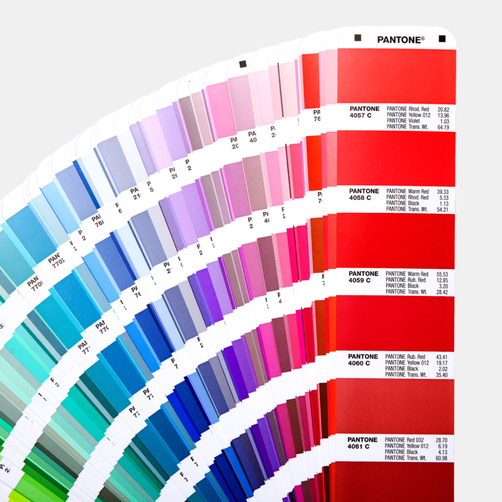
At the hands of employee-turned-owner Lawrence Herbert, the company came into focus in 1963 with the introduction of the Pantone Matching System, a proprietary tool designed to streamline the “selection, articulation and reproduction of consistent, accurate color anywhere in the world.” Launched with a palette of 500 colors engineered for use in the graphic arts industry, the Pantone Matching System now encompasses more than 10,000 coded “color standards” — including neons and metallics — that can be applied to architecture, interior design, textiles, apparel, cosmetics and myriad points in between.
In 1986, the company established the Pantone Color Institute, a consulting service that forecasts color trends, develops custom colors and helps brands “leverage the power, psychology and emotion of color in their design strategy.” Decided by color experts considering global issues, lifestyles, trends and every imaginable aspect of design, the institute’s broadest impact arrives with the annual announcement of the Pantone Color of the Year.
At the dawn of the new millennium, the institute inaugurated this tradition with Cerulean Blue — a serene hue famously broken down by Anna Wintour-inspired editrix Miranda Priestly (portrayed by Meryl Streep) in the 2006 dramedy The Devil Wears Prada. Schooling her assistant Andy Sachs (Anne Hathaway) on the origin story of her “lumpy blue sweater,” Priestly explained that it’s “not just blue, it’s not turquoise, it’s not lapis, it’s actually cerulean.”
In the following two decades, blue emerged as a touchstone for the institute, which selected Aqua Sky for 2003, Blue Turquoise for 2005, Blue Iris for 2008, Turquoise for 2010, Serenity for 2016 and — as you may have already heard — Classic Blue for 2020.
In addition to summing it up as a universally experienced, ultra-relatable hue based on “the color of the sky at dusk,” the institute has assigned Classic Blue a wide array of enviable properties — timeless, versatile, confident, dependable, thoughtful, genderless, elegant, the list goes on.
Speaking to CNN about the initial selection of Cerulean Blue in 2000, Pantone Color Institute Vice President Laurie Pressman explained, “We were moving into Y2K and wondering: Is the world going to fall apart?” Similarly it seems, the institute forecast Classic Blue as a visual antidote to pervasive anxiety surrounding unrest in the U.S., the U.K., China, Syria and beyond. Pressman echoed that sentiment in an interview with Time, saying, “From now and then [1999], there’s the same feeling of trepidation about the world, which is why, based on what we saw happening in our global culture, we selected Pantone 19-4052, Classic Blue, to be our color of the year for 2020.”
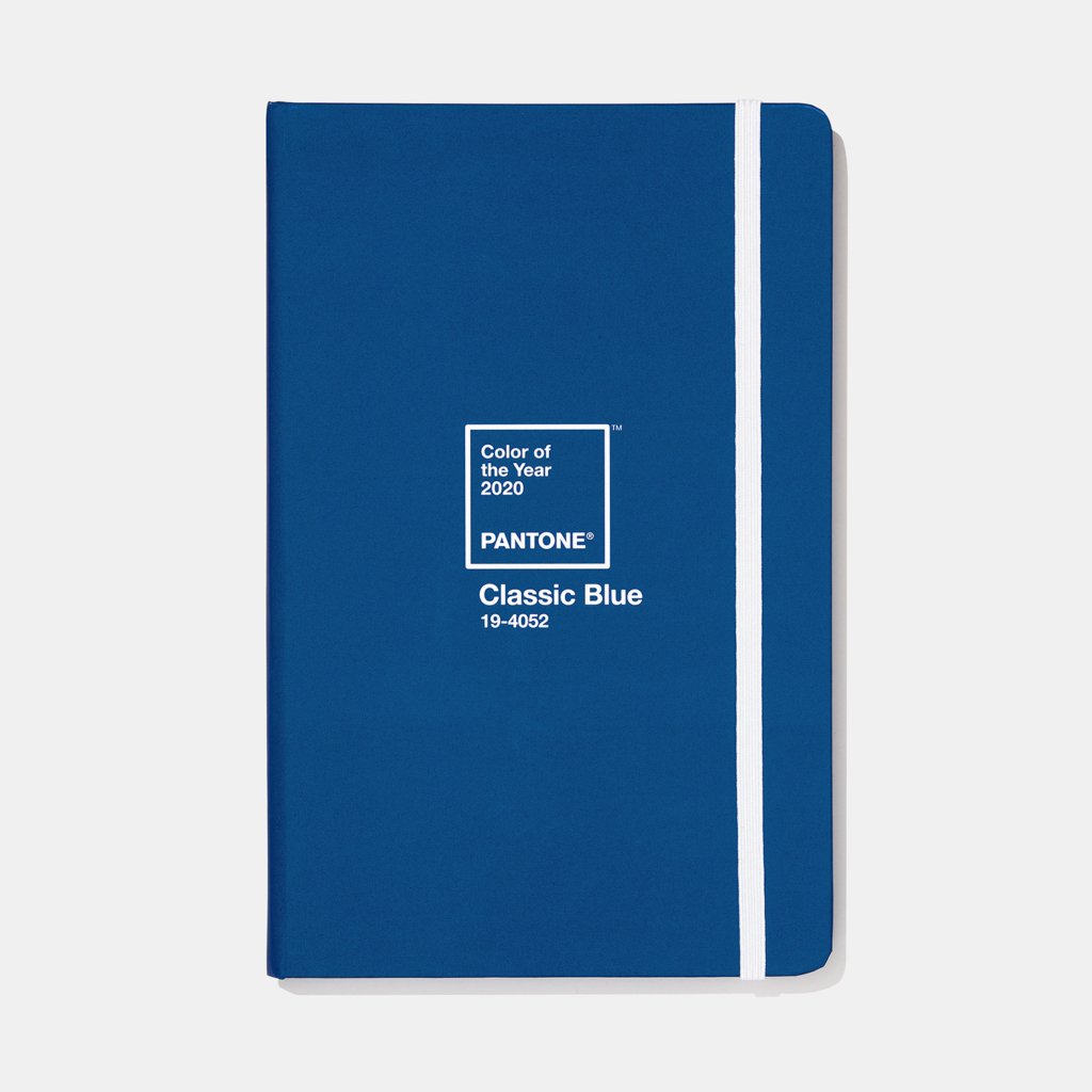
Despite some unsurprising assumptions, Pantone has insisted that the election of Classic Blue for 2020 wasn’t politically motivated and, as CBS News reported, “wasn’t a nod to the hue associated with the Democratic Party.” All politics aside, adding a splash of Classic Blue to your life (whether it’s an accent wall in your home or office, a crisp new blazer or a bottle of nail polish) should be much simpler than it was to embrace Living Coral, Pantone’s notoriously polarizing Color of the Year for 2019.
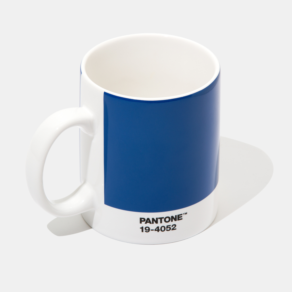
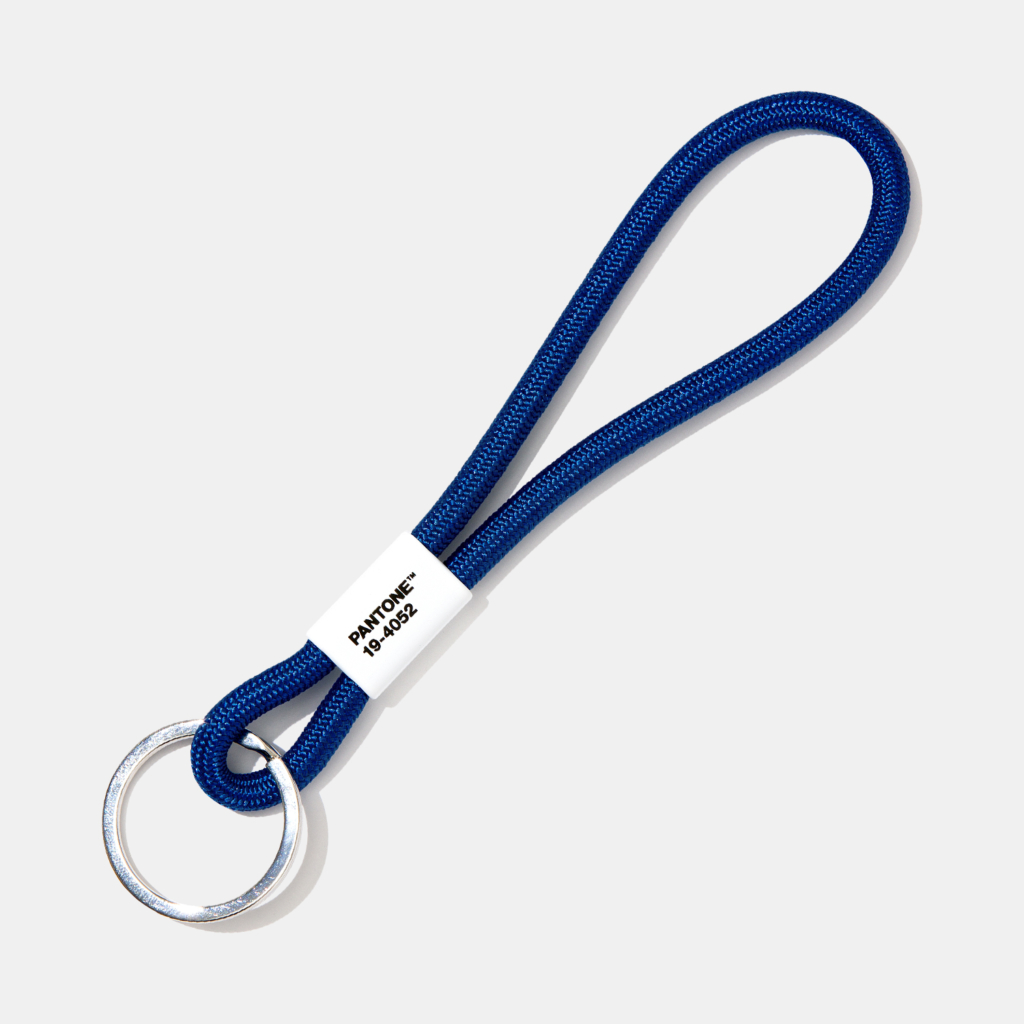
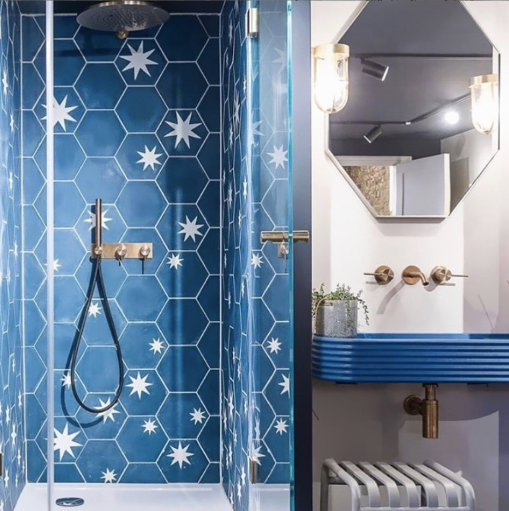
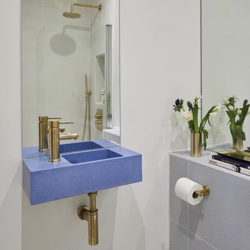
While the color gurus at Pantone have naturally whipped up a line of Classic Blue products that include notebooks, coffee mugs and key chains, we’ve also collected an assortment of home accents that nod to the universal appeal of Classic Blue and, like the color itself, promise to stand the test of time.
Devon&Devon
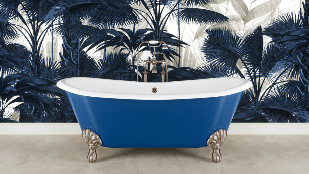
Launched in Florence in 1989, the Italian design company Devon&Devon smartly fuses the rich history of its birthplace with era-spanning inspirations from across the globe. Although rooted in a reverence for tradition, craftsmanship and raw materials, the Devon&Devon aesthetic is undeniably adventurous as it nods to everything from Art Deco and Art Nouveau (and specifically the Italian sibling Stile Liberty) to old-school Hollywood glamour and the eclectic opulence of Fellini’s 1960 classic La Dolce Vita. Known for super-chic tubs, covetable vanities, graphic marble flooring, statement-making wallpapers and plenty in between, Devon&Devon has been vocal in its support for Classic Blue in 2020, citing an admiration for its “timeless beauty” and an appreciation for “tradition as a solid base on which to carry out new experiments.” While potential members of the Classic Blue family are easy to find in Devon&Devon’s unique floor and wall coverings, their cast-iron Admiral tub is a no-brainer as it can be customized in more than 500 colors, including more than a dozen shades of blue.
Fantini
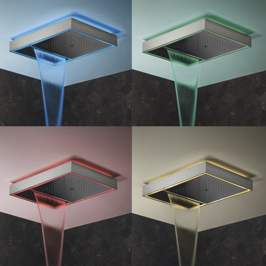
Although humbly billed as “a typical example of an Italian design factory,” Fantini is anything but ordinary. Founded by brothers Giovanni and Ersilio Fantini in 1947, the company has long drawn inspiration from the natural beauty that surrounds it — including “the constant presence of water and the serene atmosphere” offered by Lake Orta, a tranquil body of water shaded by the Alps of Piedmont. Over the decades, Fantini’s close connection to water has informed minimalist fixtures, classical sinks and tubs, and I Balocchi — a playful line of taps introduced in Milan in 1978. Customizable in a rainbow of admittedly “garish colors,” the line does much more than enliven kitchens and powder rooms as product sales benefit Fantini’s efforts to construct water outlets in Burundi, Africa. More recent developments in the Fantini universe include translucent colored accents that artfully punctuate the sleek Nice Collection and a high-tech Aquadolce showerhead that comes equipped with a backlit chromotherapy feature that will literally bathe you in colored light.
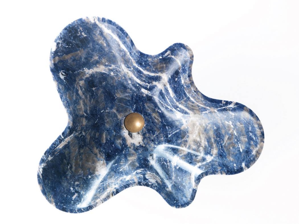
Fersa
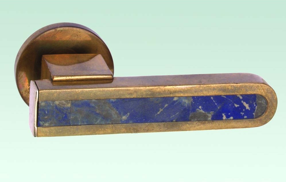
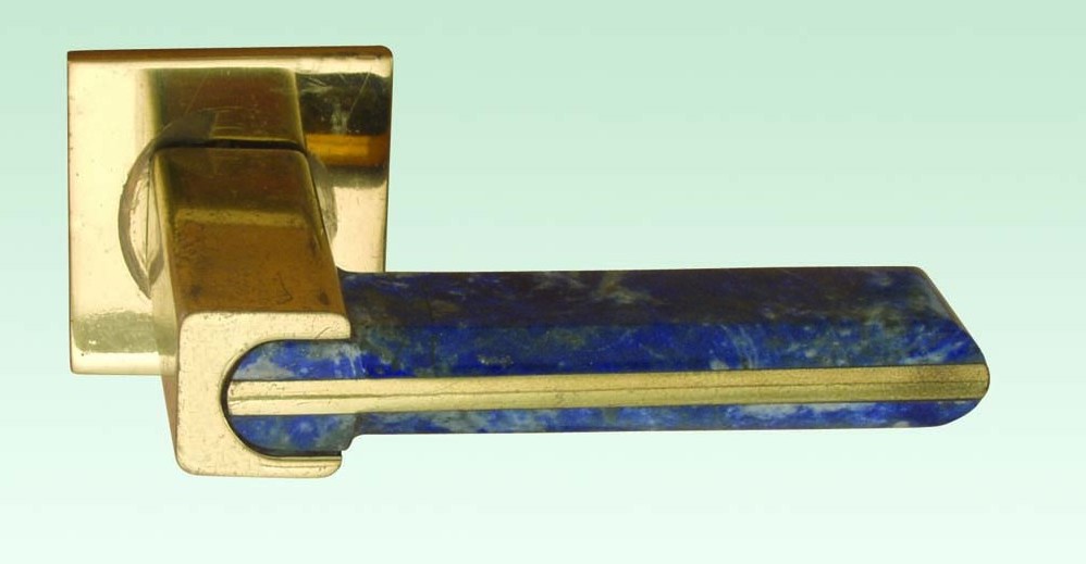
Established in Argentina in 1941 with an initial goal of preserving European designs and artisanal traditions disrupted by World War II, Buenos Aires-based Fersa has long been a trusted source for decorative hardware in Latin America but didn’t reach U.S. showrooms until 1988. Based largely on its heritage, Fersa is best recognized for old-world designs but also takes cues from slightly more modern sensibilities that range from Art Deco to Bauhaus. While Fersa crafts opulent chandeliers, sculptural faucets and intricate banister railings, the company’s Stone and Marble Collection (which was introduced in 1990) presents multiple ways to dive into Classic Blue in the form of levers rendered in brass with natural stone insets and accents — including rare blue sodalite and metamorphic lapis lazuli mined from the Andes.
Kast
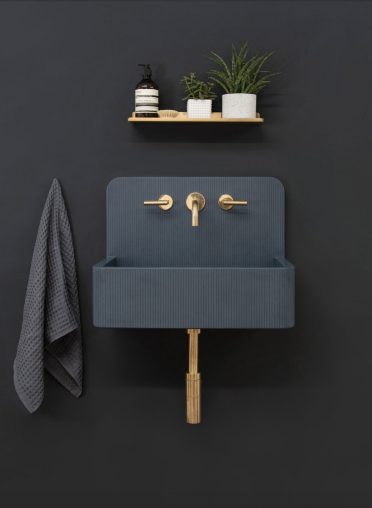
Founded in 2013 as an extension of creative director Tim Bayes’ studio Lowinfo, the British company Kast has built a solid reputation by challenging preconceived notions of an oft-overlooked medium: concrete. Through years of experimentation, Bayes developed methods of infusing “liquid stone” with tints and additives that give his signature Kast wash basins an undeniable elegance and tactility. Fabricated mere miles from England’s fabled Sherwood Forest in a diverse assortment of contemporary styles, Kast concrete basins can be personalized in 28 distinct colors, including two that conjure the sky — a cheery Blue and a moodier, dusky hue aptly dubbed Storm. A recent development, the company’s Kast Canvas Collection brings sculptural depth to the mix via linear patterns that enhance the basins’ facades with geometric shadows.
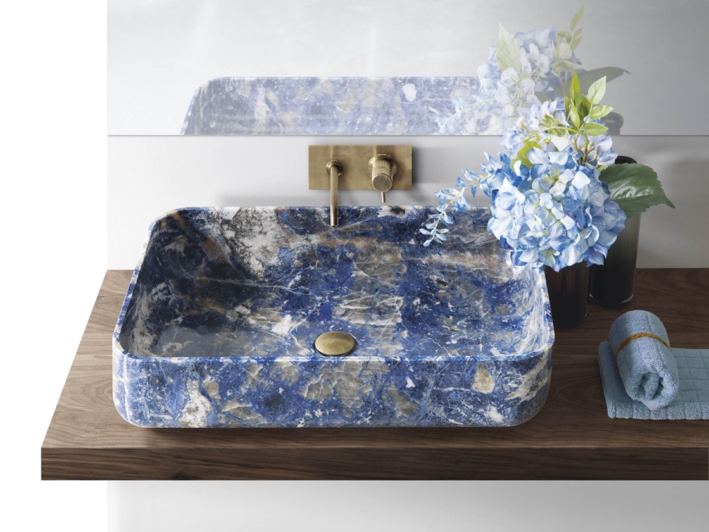
Kreoo
Named in reference to the Greek verb kraino (to create or realize), Kreoo is the 10-year-old offshoot of Decormarmi, a revered Italian design studio founded in 1963. Based in the Northern Italian province of Vicenza, Kreoo follows in the footsteps of its parent company by taking marble to unexpected new heights — from organically shaped sinks and tubs to avant-garde furniture to wall and floor coverings inspired by Venetian palaces. Placing its designs “halfway between minimalism and sculpture,” Kreoo’s been on team Classic Blue long before 2020 as a big proponent of blue sodalite — a rare blue marble characterized by striated patterns that have been likened to “a velvety cobalt sea furrowed by golden waves.”
Matthew Studios
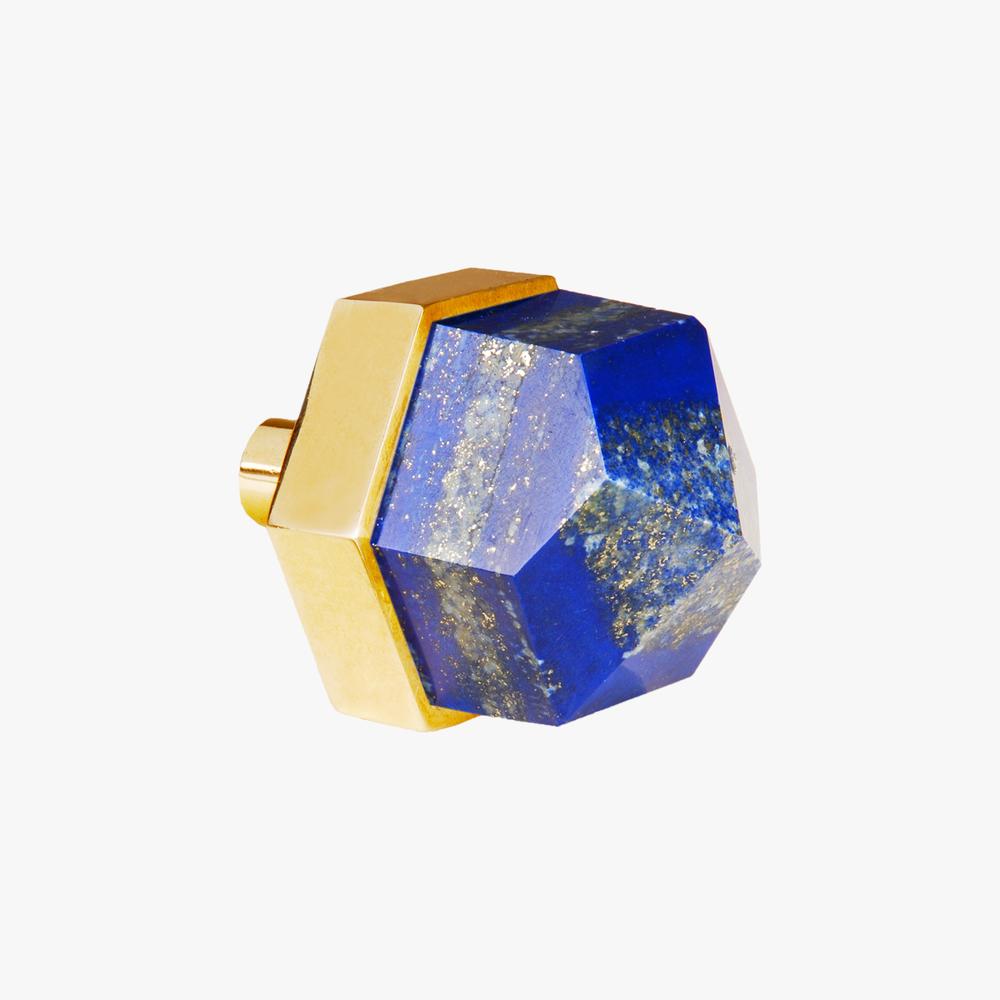
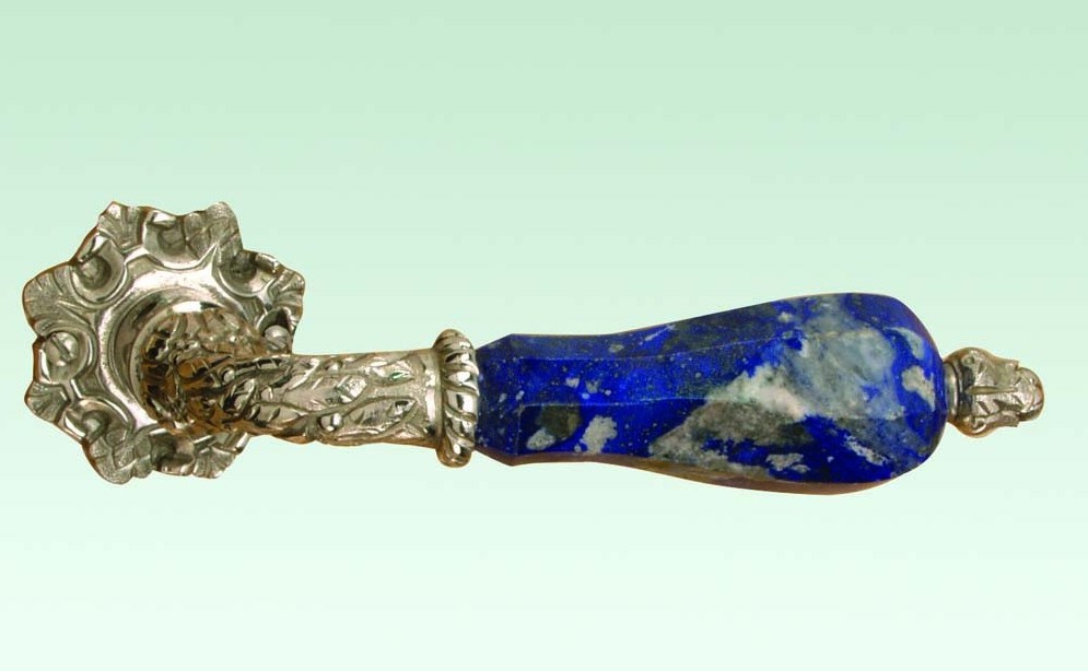
Armed with a working knowledge of fine art, interiors and lighting design, Katherine Wildt O’Brien launched Matthew Studios in 2008. Inspired by the beauty of the natural world as well as her passion for “travel, jewelry, painting and flea market vintage,” O’Brien’s line encompasses stylish sconces and lamps, elegant end tables and bespoke hardware embellished with semi-precious gems and quartz crystals. It’s safe to say Matthew Studio was also ahead of the Classic Blue curve as their chic knobs and pulls have long incorporated lapis lazuli, an intense blue crystal that’s been described as “one of the most powerful gemstones in the mineral kingdom” and even dubbed the “wisdom keeper.”
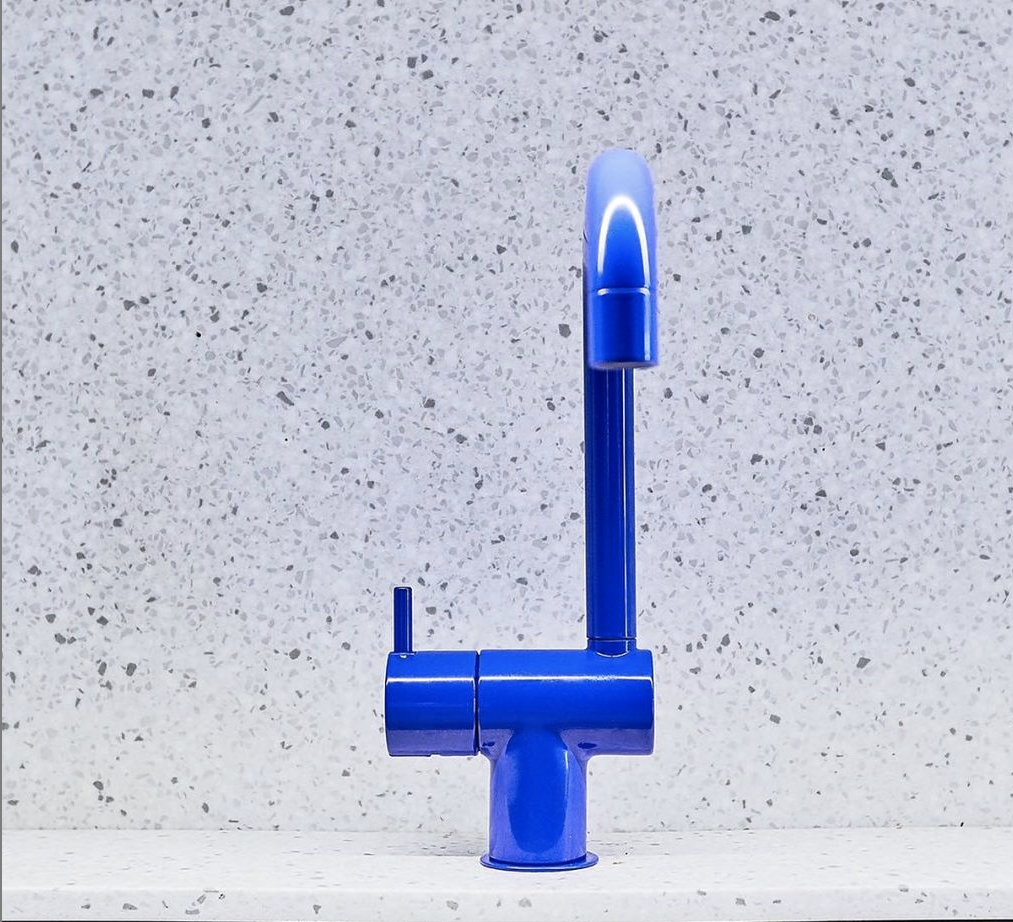
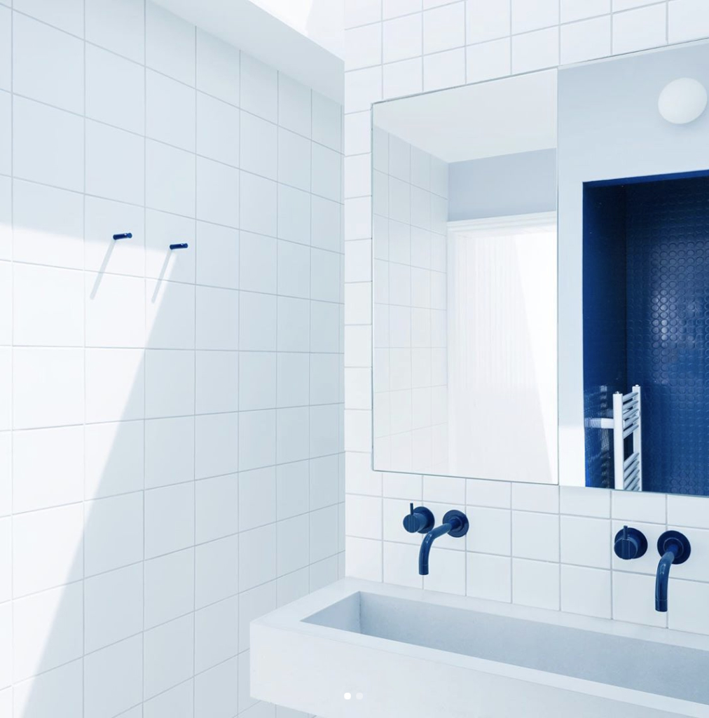
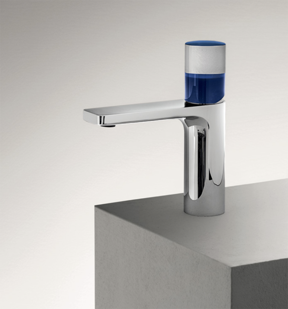
Vola
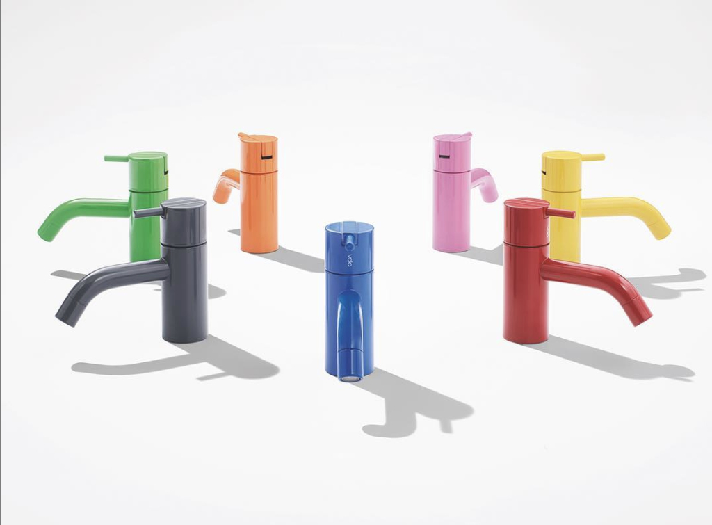
Although possibly best recognized for his chair designs, including the Ant, the Egg and the Swan, Danish architect and designer Arne Jacobsen (1902-1971) shook up the decorative plumbing industry in 1968 by designing the first VOLA taps for the National Bank of Denmark. Two years after introducing an innovative, streamlined design that hid the mixer mechanics to showcase only the handles and spout, Jacobsen made another splash through bold experiments with color. Launched with just two options (orange and a rich grey inspired by concrete), the VOLA palette quickly expanded to 10 colors. While maintaining the integrity of Jacobsen’s iconic designs, the award-winning Danish brand has expanded the spectrum to include “27 colors and counting,” including two that fall within the realm of Classic Blue: Light Blue (Color 4) and Dark Blue (Color 15).